
Project
03 / 05
Client
Brandi — E-commerce
Year
2025
Services
UX Research, Competitor Audit, User Flows, Mobile App Design, Design System
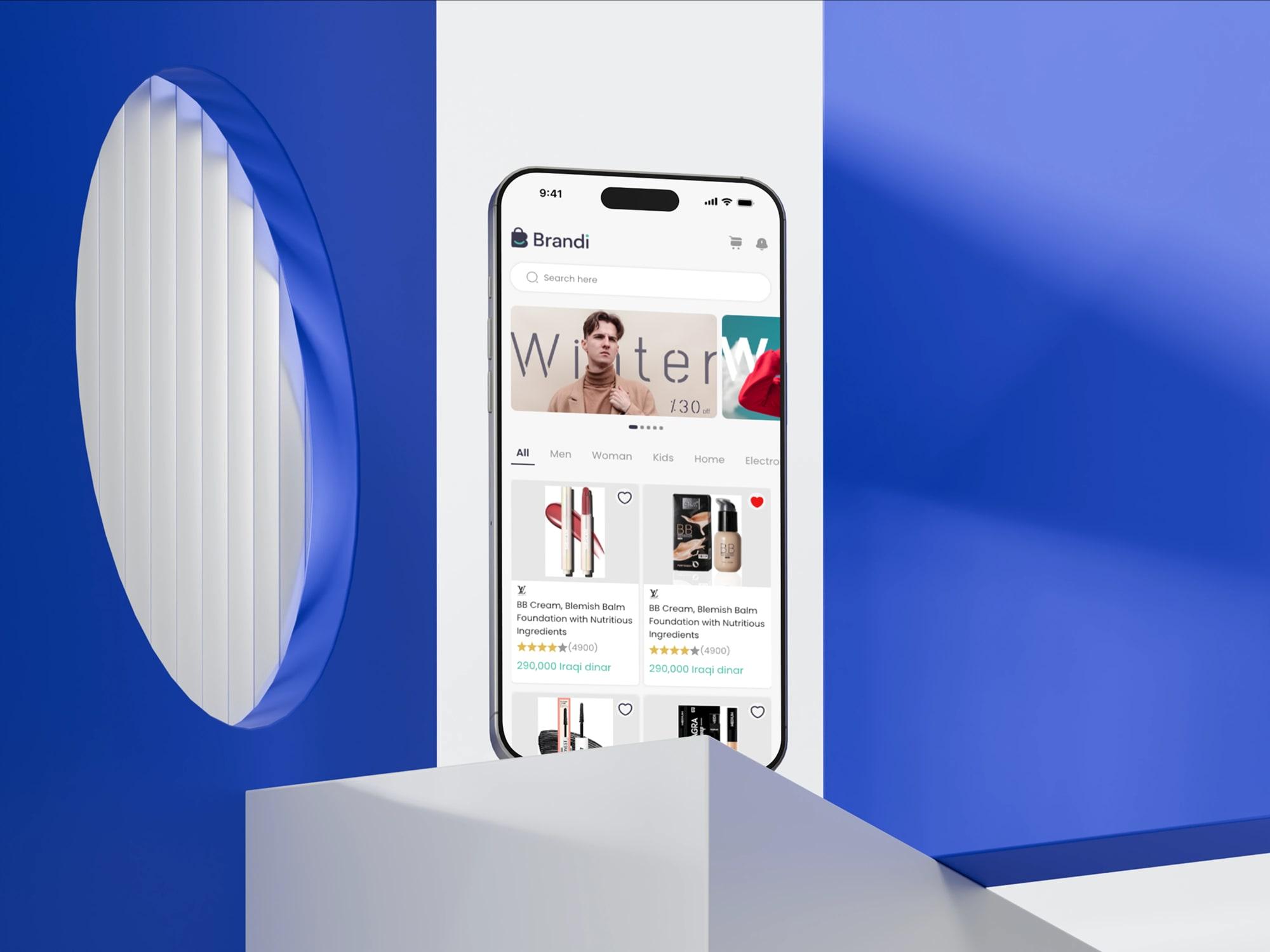
Brandi Mobile App
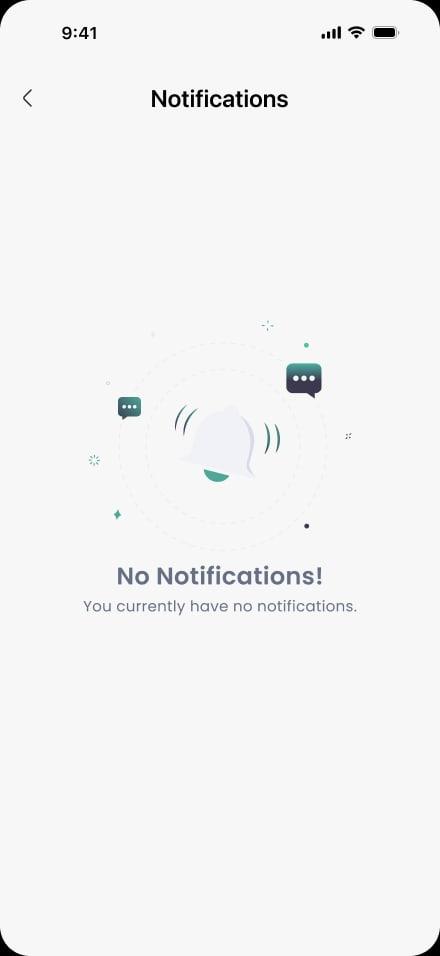
Clarity-first e-commerce — five clean tabs and one bold CTA per screen.
Section
Overview
Overview
Brandi needed a mobile storefront for a market full of overloaded e-commerce apps.
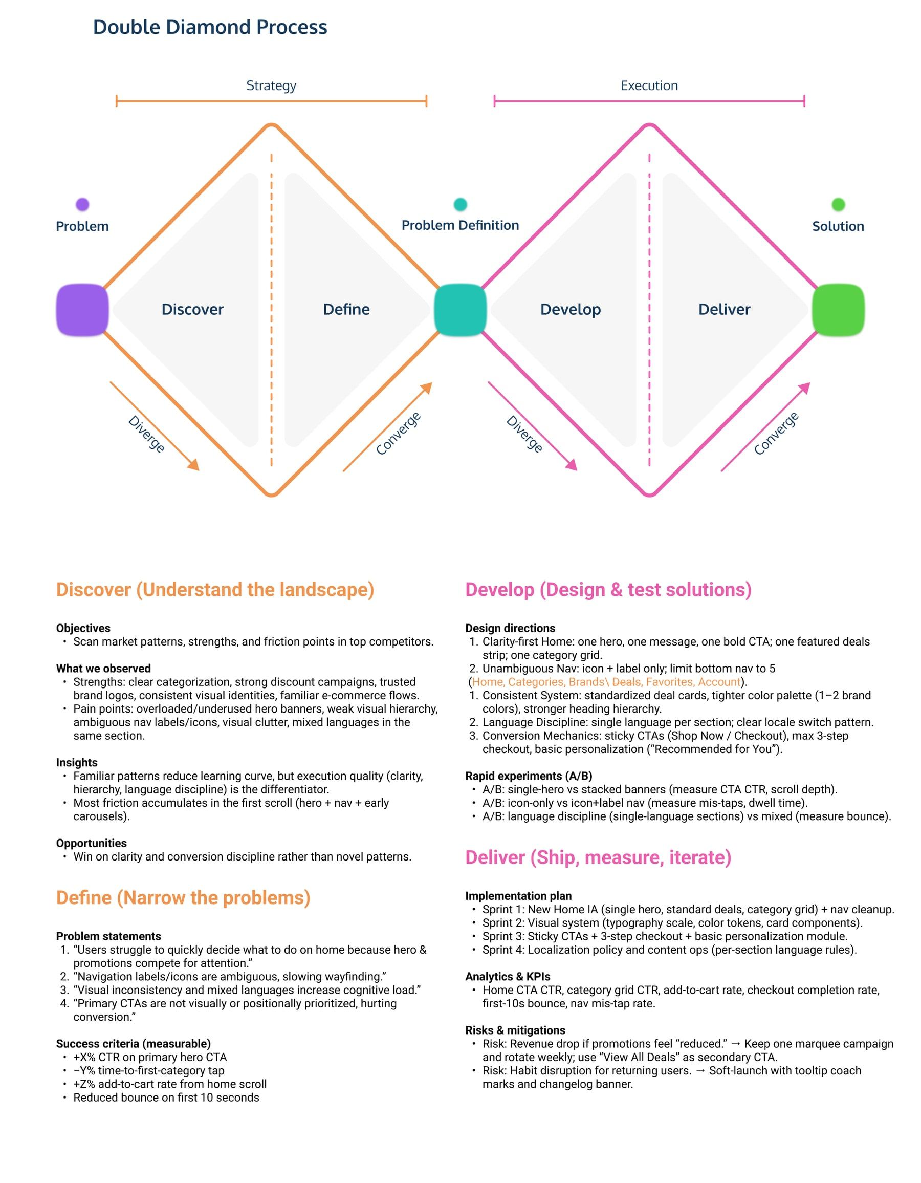
We started with a Double Diamond — a competitor audit across five regional players (Onelaty, Adidas, Ordary, Emaa, Ubuy), then narrowed to four sharp problem statements before designing a clarity-first home, a five-tab nav, and a three-step checkout.
Every screen ships with one job and one bold CTA.
Section
Problem
Problem · 01
Users struggled to decide what to do on the home because the hero and promotions competed for attention.
Problem · 02
Navigation labels and icons varied, slowing wayfinding.
Problem · 03
Visual inconsistency and mixed languages increased cognitive load.
Problem · 04
Primary CTAs were not visually or positionally prioritized, hurting conversion.
Section
Solution
Solution · 01
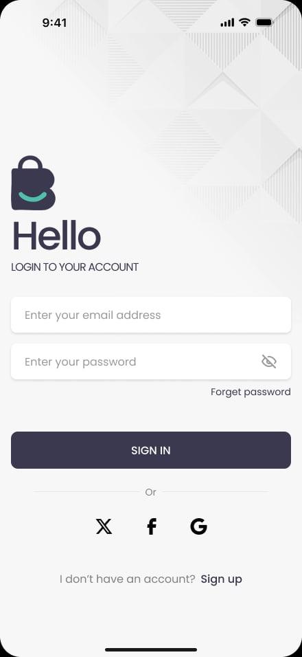
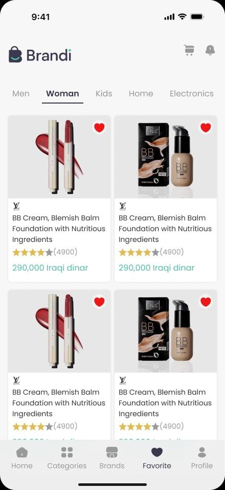
Clarity-first home — one hero, one message, one bold CTA, one featured deals strip, one category grid.
Solution · 02
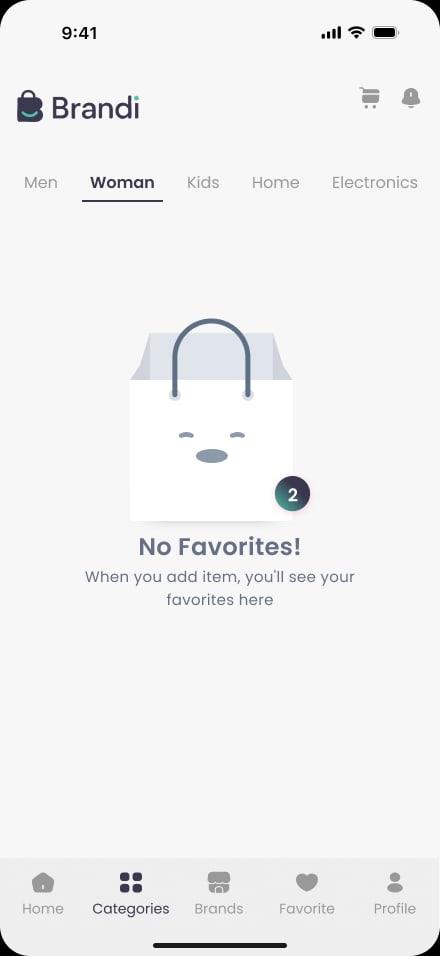
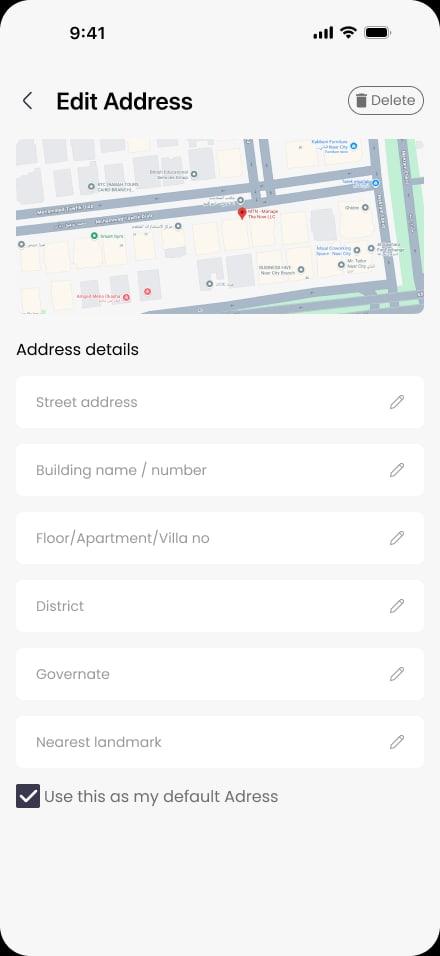
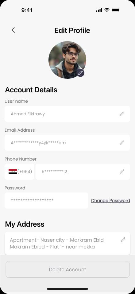
Unambiguous nav — icon + label, locked to five tabs (Home, Categories, Search, Favorites, Account).
Solution · 03
Consistent system — standardized deal cards, tighter brand palette, stronger heading hierarchy.
Solution · 04
Language discipline — single language per section with a clear locale switch.
Solution · 05
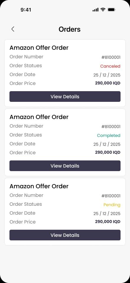
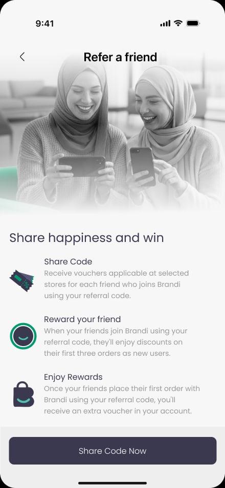
Conversion mechanic — sticky CTAs, three-step checkout, basic personalization.
Section
Process
Process · 01
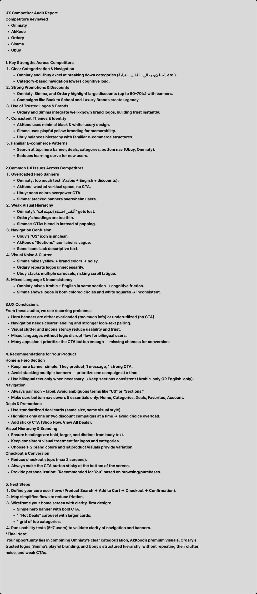
Competitor audit across five regional e-commerce apps — Onelaty, Adidas, Ordary, Emaa, Ubuy
Process · 02
Define — narrowed the audit into four sharp problem statements with measurable success criteria
Process · 03
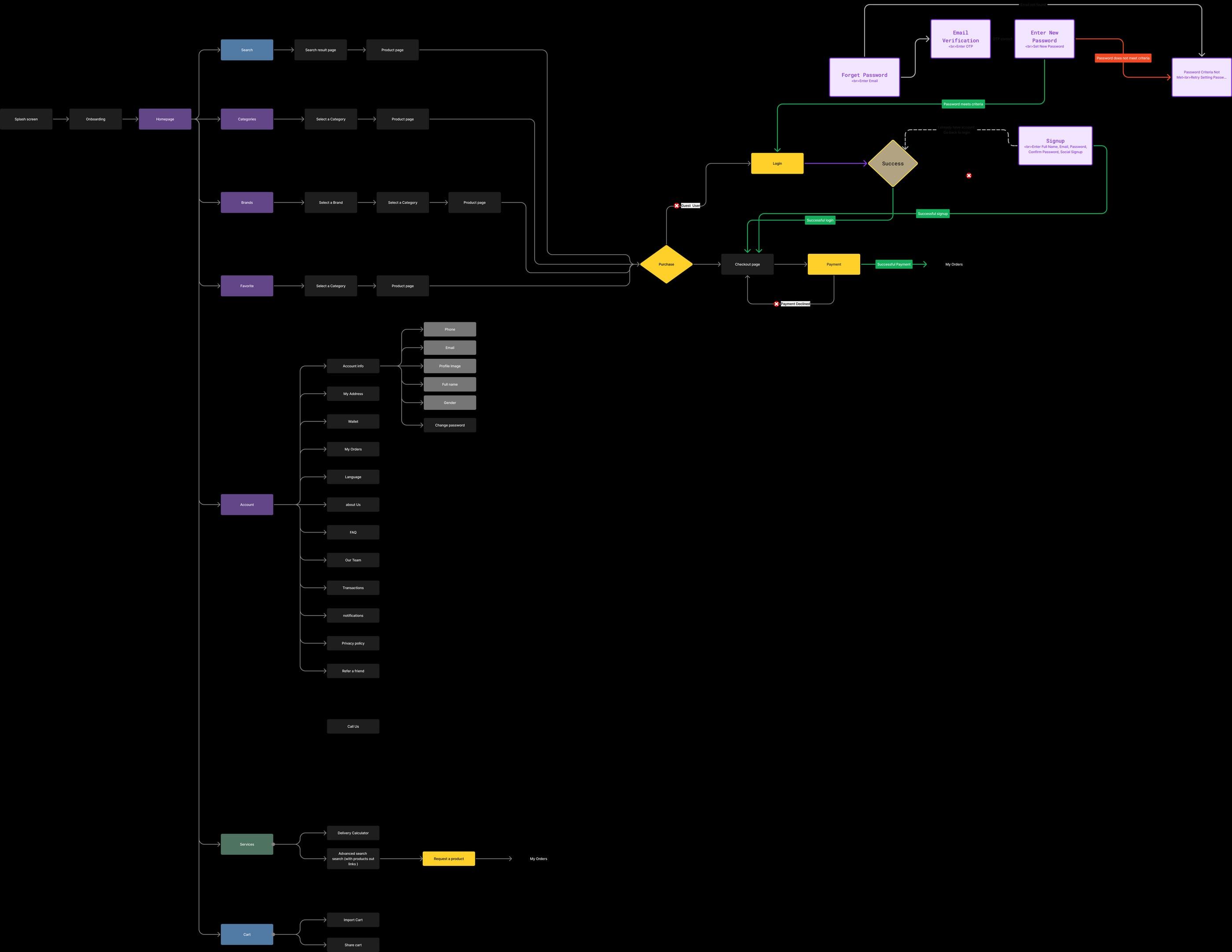
User flows — splash → onboarding → home, with branches for search, categories, brands, favorites, cart, login, signup, forgot-password and checkout
Process · 04
Information architecture and low-fi wireframes for the clarity-first home and five-tab nav
Process · 05
High-fidelity UI in the Brandi brand — standardized deal cards, sticky CTAs, three-step checkout
Process · 06
Rapid A/B experiments — single hero vs stacked banners, icon-only vs icon+label nav, single-language vs mixed sections
Process · 07
Implementation in four sprints — IA cleanup, visual system, sticky CTA + checkout + personalization, localization policy
Section
Flow
Artifact · 01
User flow
End-to-end flow — search, categories, brands, favorites, login/signup, checkout and account
Artifact · 02
Double Diamond — process
Discover · Define · Develop · Deliver — competitor audit, problem statements, design directions and the four-sprint implementation plan
Artifact · 03
Competitor audit
Five regional e-commerce apps reviewed — strengths, recurring UX issues, and the recommendations we built Brandi against
Section
Screens
Section
Outcome
Outcome · 01
Live on Google Play
Outcome · 02
5-tab navigation, locked
Outcome · 03
3-step checkout
Outcome · 04
Single-hero home pattern
See it live